
Sisu
Summary
Sisu is an AI-powered fitness app designed to help users reach their dream physique. For this project, I was responsible for developing the brand identity and for designing the user experience and interface of the app.

Deliverables
Foundational branding
UI-design
Year
2024
Chapter 1: Foundational branding
In search of the story
To capture Sisu’s essence, we started this project with a kick-off to interview the owner, Semmy, about his entrepreneurial story. By deep diving into his ‘why’ I was able to identify the core values behind this product and then translate his vision into a visual language of colors, shapes, and typography.
A key insight emerged: Semmy’s philosophy boiled down to ‘hard on the standards, soft on the person’. This duality inspired the high-contrast branding, balancing bold colors with soft letterforms and rounded shapes.
The final color palette

Chapter 2: UX/UI design
Writing the story
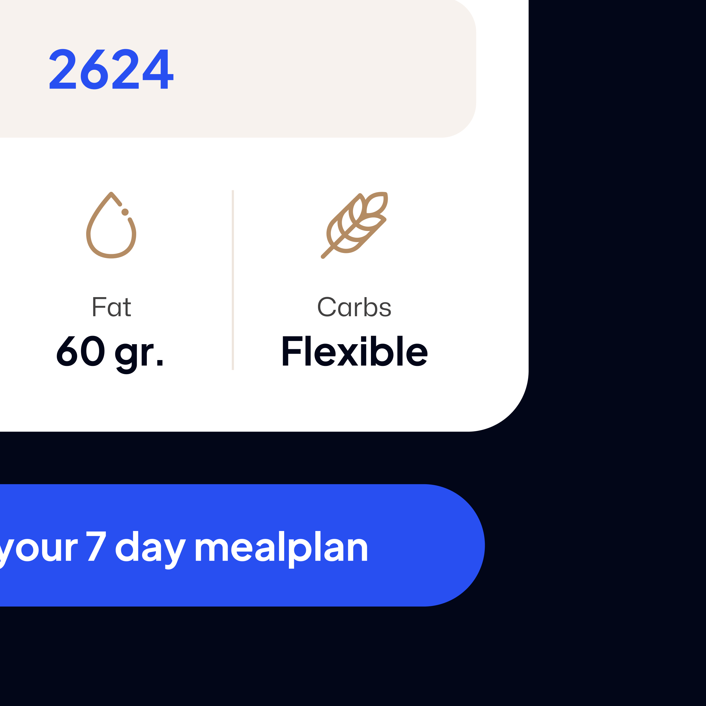
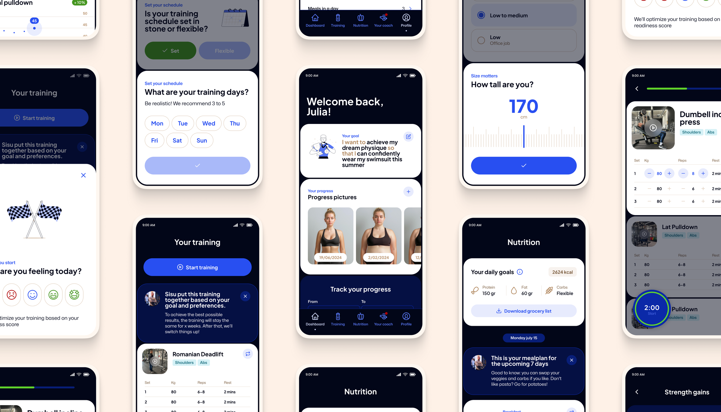
With the brand identity done, I moved on to the app’s design. I began by developing UI components to establish the look and feel, and then facilitated a discovery session to gather requirements for the UX of the MVP.
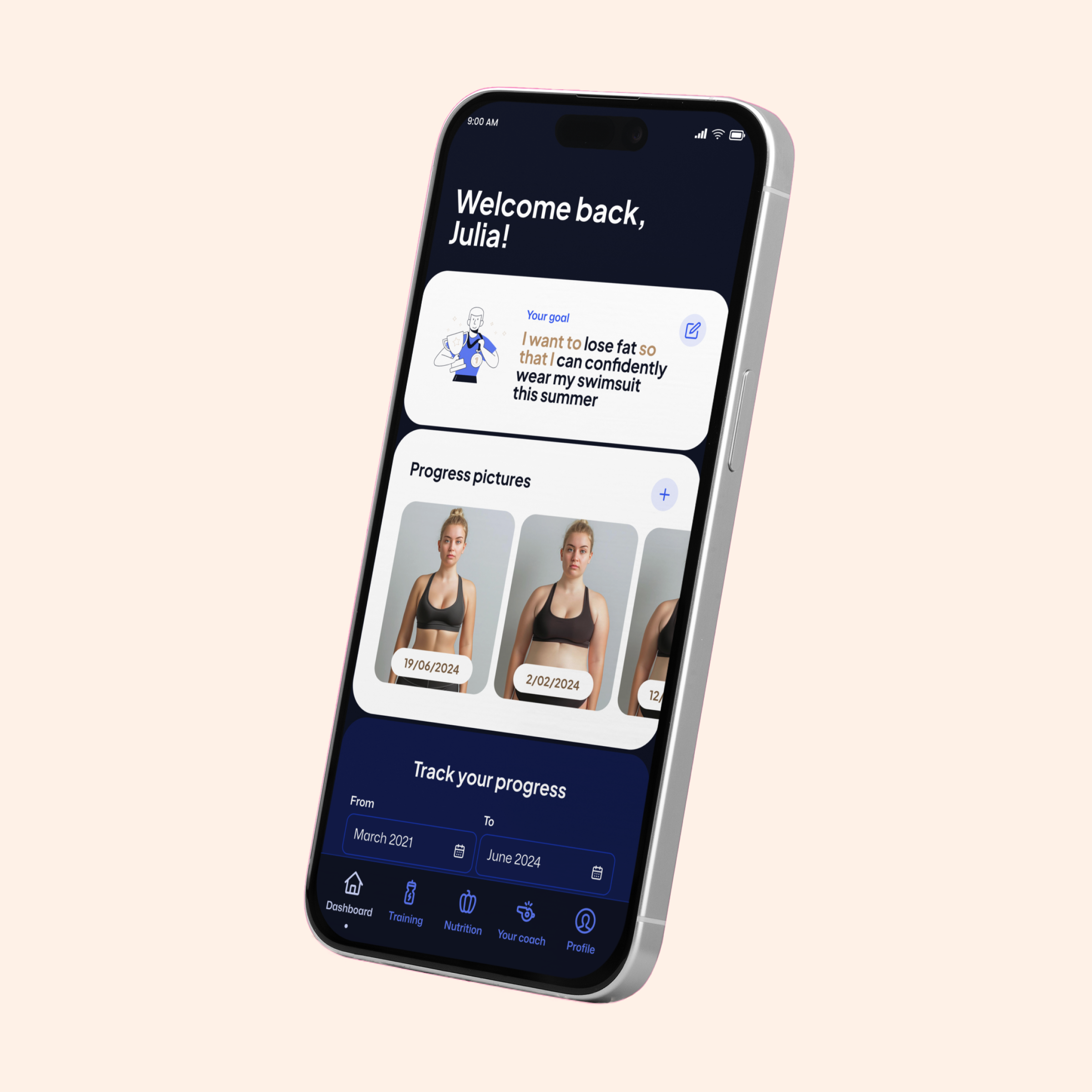
This collaborative phase involved weekly check-ins over several weeks, in which I presented design iterations and received feedback from Semmy and the project’s developer. This continuous loop of designing, gathering feedback and refining made sure the final app design was complete, aligned with project goals and ready for development.
During these sessions, it was important for us to maintain a strict focus on the MVP’s scope and budget. While new ideas frequently popped up — as they do in creative processes — we clearly distinguished ‘must-haves’ from ‘nice-to-haves’ and put the nice-to-haves on the backlog for phase 2.
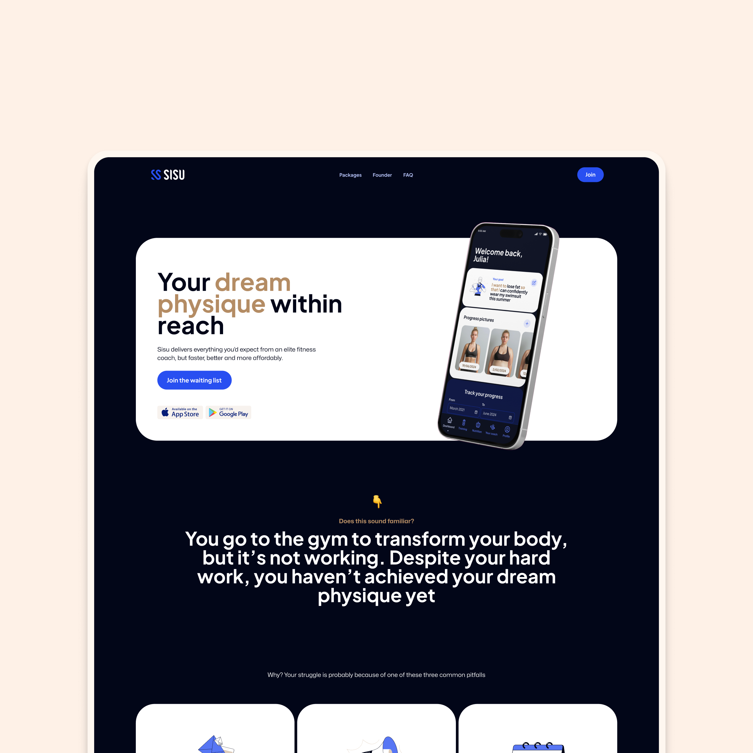
Chapter 3: Landing page
The final chapter
To conclude this project, I designed a landing page in the same high contrast style as the app.
Epilogue
Personal reflection
I am very happy with the design I was able to deliver within the scope of this MVP. By initially keeping the branding concise and focusing on the app’s most crucial features, I was able to deliver lots of value in a small amount of time.
The process we followed was absolutely key in achieving this result. Our weekly check-ins and discussions about all updates allowed us to make quick decisions and pivot if needed. This resulted in an app that perfectly aligns with Sisu’s core ambition: making a dream physique attainable for everyone.
UX-principles encourage me to use as few words as possible, but there’s a lot more to this project that I’d love to share! If you’re curious to hear more, let's schedule a call to dive into the details.